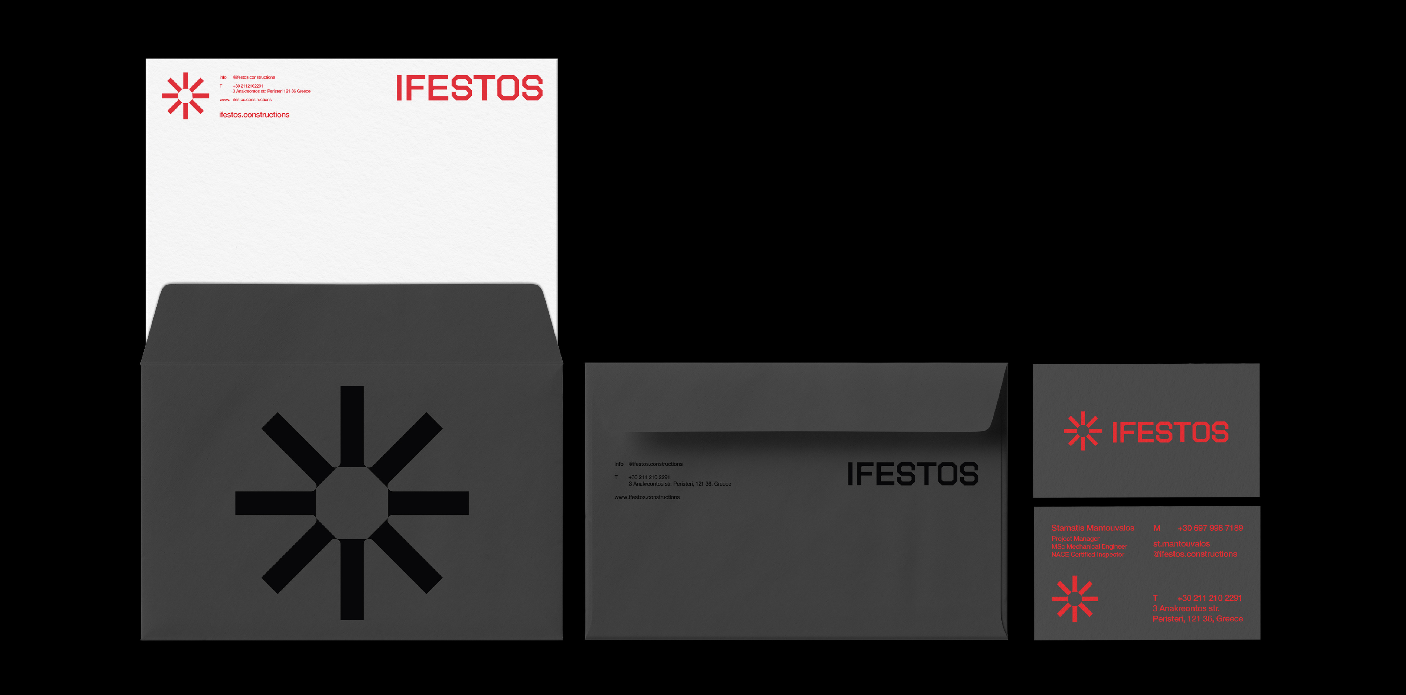
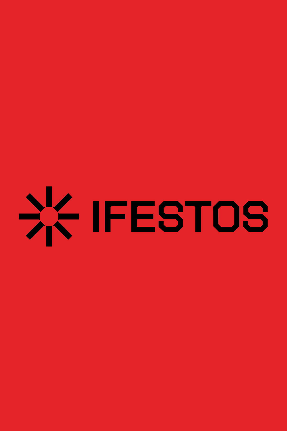
The logo reflects the company’s values of reliability and stability and the range of services and materials the company works with, like metal and concrete. Inspired by the typographic asterisk, the mark symbolizes cross-referencing in complex systems, highlighting the company’s diverse services and industrial applications.
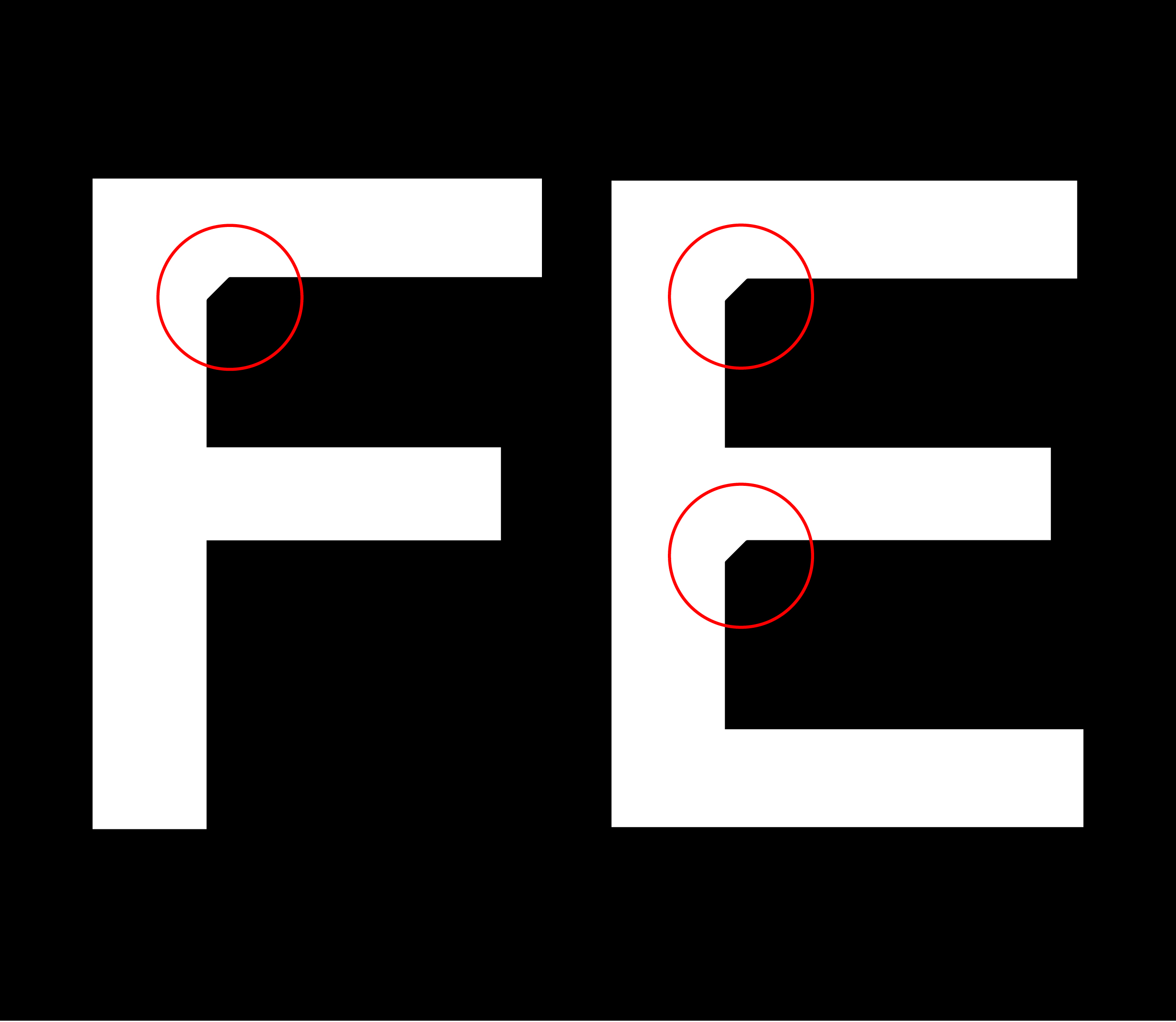
Observing Ifestos work in setting up complex scaffolding solutions, we developed a custom font with metal-inspired elements to highlight the brand’s industrial character.
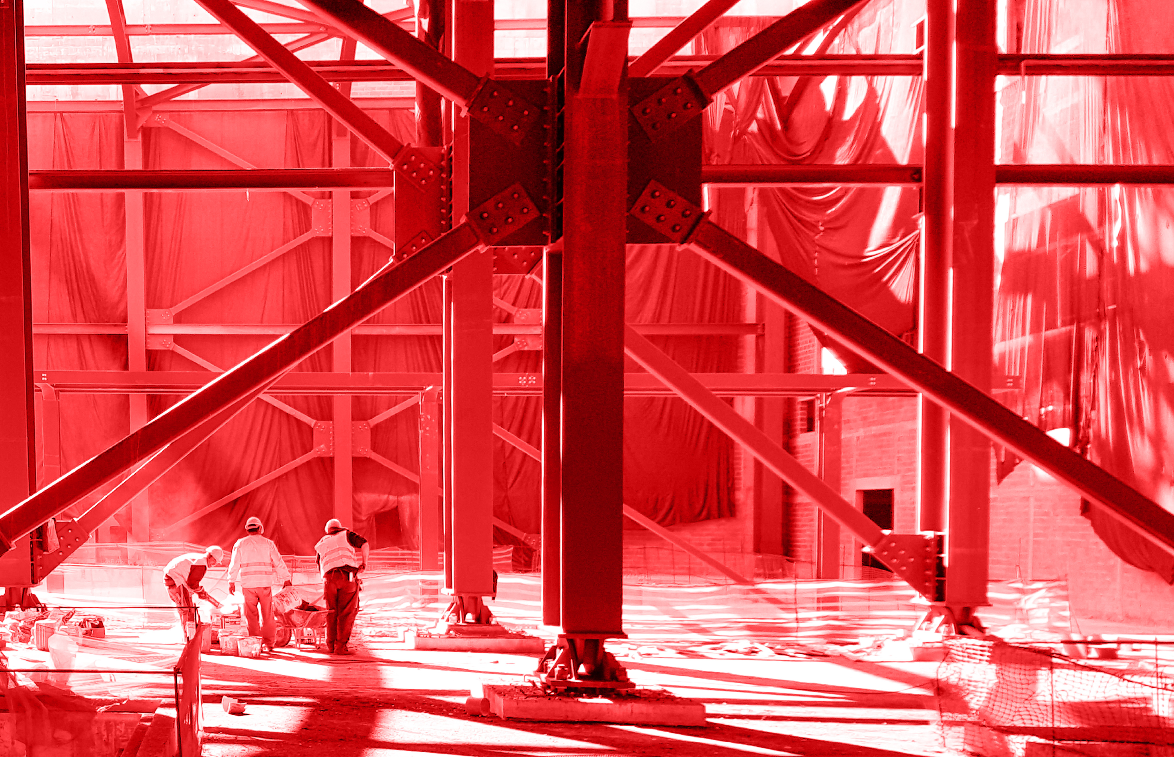
In digital applications, light moves across the mark, shifting shades of the primary red to evoke the resilience and solidity of metal structures.